Deadly Heat Wave in Pakistan
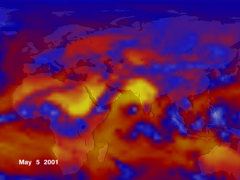
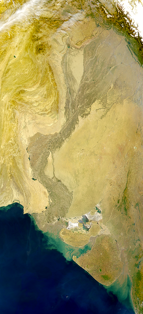
CERES measured the thermal energy emitted from the regions of the Indian subcontinent and northern Africa, as shown in this image from May 2001. The heat wave in Pakistan that killed at least 33 people the weekend of May 5-6 is seen in yellow as a region emitting high values of thermal energy. What do the colors mean? The smallest amount of Earths radiation emitted to space is shown in white over Greenland and Antarctica. The levels of energy increase from blue to red to yellow. The greatest amounts of heat emitted are from the Sahara Desert and the Arabian Peninsula. Cold, blue-colored temperature ranges are found not only at high latitudes, but also in the tropics from cloud tops of thunderstorm systems so extensive that they span thousands of miles. For more information, see the CERES Press Release on the Earth Observatory.
Gallery

